
Thursday 26 September 2013
initial ideas
image annotation

For the band image we do want a more casual look as it will show that they are people and the indie genre is about emotional journeys and self discovery, as an example of this it would be death cab for cuties - soul meets body as it shows the path in which music guides us.
song details
We chose Lost in the basement by Canterbury. This is because they are a British Indie Rock Band which is the main aspect we had been researching into. We also chose the song as it would be easier to edit to as it is up beat and there are clear points in which cuts would be possible. We also chose the song as it sparked a lot of ideas so we feel that we could do a lot with it.
lyric annotation


For the lyric annotation we went along and decided what each aspect of the song could mean and how we could create it. For the most part each part gave us the sence of a darker outcome therefore leading us to the idea that the song was dark/mysterious.
Tuesday 24 September 2013
Post 2 - Roles
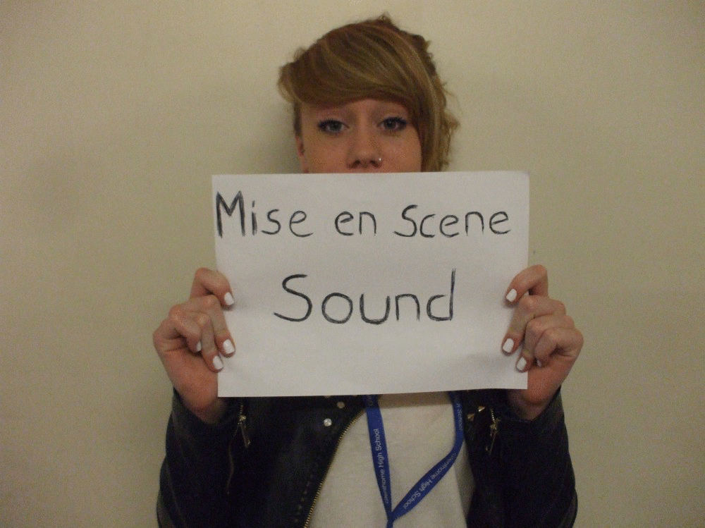
Here are the roles of our group. We chose the roles that thought were applicable to our strengths, for me editing is a task which i enjoy doing and since music videos need to be edited a lot i chose to do it as i am comfortable editing and i enjoy the song (even though your meant to hate it after listening to it over and over, but i listen to some songs like that anyway). For Demi we chose directing as she is the most organized and knows what needs to be done and when it needs to be completed by. For Hannah we chose camera and lighting as she does photography therefore she will have attention to detail and will be able to film the best shots. Finally we gave Toni mise-en-scene and sound as she will be able to dress the set in a certain way which is aesthetically pleasing and sound wouldn't be an issue due to the music video having a sound track.
Monday 23 September 2013

Friday 20 September 2013
graphs

This graphic shows the demographic for our music videos. The results from our questionnaire show an almost even amount for each gender. Out of the 79 people we gave the questionnaire to 39 of them were male and 40 of them were female. This shows a mostly even spread between both genders. Therefore we will try and target both genders equally, so include things that attract males and that also attracts females.


Our target audience is going to be people who like to be themselves and who follow their own dreams instead of going along with what everyone else wants to do. The gender of the person does not matter as it can be equally spread between both. We also want our target audience to be people with an appreciation of things which are different compared to what people are usually seeing so people who are open to hearing or seeing unusual things (such as maracas in a rock music video). Our target audience in essence are people who are considered 'indie' or 'hipster' as they are people who dress and act differently from everyone else.
Thursday 12 September 2013
The killers screencast
Transcript:
The video for the killers video read my mind the basic
concept is quirky and different. This is shown through the close ups of things
such as a green monster costume and a Japanese Elvis street performer. For the
performance shot is has been shown in an arcade which is a very unusual place
for a band to perform as there is normally not enough room and it doesn't look
like a professional studio. The lip synch however is shown in what looks like
new York. The tempo of the video is pretty slow but the music is upbeat and the
music video is cut off beat rather than on the beat. Most of the props within
the video are quirky as there is an old bicycle with the larger wheel at the
front and a smaller wheel at the back. The singer is mostly shown in close ups
whilst he is lip synching and his performance gives off a positive feel as he
interacts with the people around him and he smiles with them. The artist is
shown with close ups when he is looking away from the camera like he is deep in
thought and then again when he is breaking the fourth wall so that it creates a
connection with the audience. The overall video shows what can be missed in
daily life and the music video basically says 'you need to slow down and enjoy
life otherwise you will end up missing all of the interesting and entertaining
things. The music video suggests than indie rock videos are about the quirkier
things in life and about enjoying every aspect of life, as well as just doing
things for the hell of it and for the fun of it as they cycle through the city
on quirky bikes.
Album Covers


Here is the Album cover for Radioheads OK Computer. The cover of the CD has the title of the album and the name of the band but the text itself is quite small and hidden in the corner showing that the band is not the main focus of the cover. The cover is quite an abstract one because there isn't really any clear meaning behind the illustration but the colour suggests the album may be calming/deppressing with a slower rhythm, also the size of the artwork in comparison to the text could suggest that it is more about the art form rather than the band itself as music in its own right is a form of art. The back of the cover shows all the songs that are on the album and these are also quite small compared to the art work. The names of the songs aswell give off an artistic feeling as they are quite quirky and each song sounds different from the other (such as subterranean homesick alien and airbag.. The illustration on the back is of a train station which is quite peculiar but it could be suggesting a location in which you could listen to the music. Overall the theme of the album cover is artistic as the center piece of both sides is the artwork as the mass blue stands out and when you look closely at what the picture is its a main road and a train station which is peculiar but it shows that the music can be for wherever you are and it is a calming album due to the fact that the main colour is blue.The cover does give off an experimental vibe due to the fact that the picture looks like it has been done on cyanotype and the image has then been distorted to give it a more hypnotic look/feel. The album is also quite unconventional as it does not show the artist but instead it shows artwork which shows the genre of music as individualistic.


Here we have the Kaiser Chief album Employment which has a textured front (it looks like leather) and the Album name and artist name are located in the center of the cover in a yellow box. The type face is quite simplistic for the band name however the text for the album name is more formal as it is made up of Serif letters. This type face connotes that when you are employed you have to look very elegant and smart when you are working even when you really are quite simple and relaxed whilst you are at home. The cd cover looks as if it is a book because of the texturing on the front and the bright yellow colour around the album and band name attracts the viewers attention to the front, the cover also looks like it should be the cover of a portfolio as it does look like leather and the yellow looks like a label so it could be that the artist is trying to show who they are and what style they are and that this album is the sum of their work. . On the back the way it has been coloured makes it look like an ending bibliography because it is made to look like the back has been folded over and it looks as if it would be on the end page of said portfolio. Apart from that it is quite a plain back which just lists all the names of the songs on the back but the real difference on this album is that they have shown a link to their website. This album is also conventional as the artist does not appear on the cover and it looks textured which is a very uncommon feature for album covers, this shows that the band is both unique and they are all about their work rather than the money that comes from it.


Here we have the Genesis We cant dance album. The front of the album shows the name of the band and also the name of the album, the text is presented in an unusual way as some of the letters are backwards which is quite a quirky technique to use but is something that makes the band name memorable. However the name of the album is shown to be less important as it is a lot smaller than the name of the band. The front of the album has two people looking up to the sky and the illustration is made up of bright colours so it seems like the album will be quite an uplifting work and it will be something to connect to people. The back of the album however shows the same two people at night which may suggest that you can listen to the music night or day but it could also show how some things can last forever or are just memorable as they remain a constant within our mind. The back also has the name of all of the songs but again it is is a smaller style so the song names would not be as memorable. The back of the album also includes the name of the record company 'virgin records' which shows that the album is quite popular as virgin records i quite a large company. This album does not have the artist on the cover either which shows that it is not about the band it is more about the artistic influence in which the music makes..
conventions of a rock music video


Imaginary role from Panic! at the discos the ballad of mona lisa and they are also dressed in black clothes. The shot itself is a midshot as you can see the top half of his body.
Within these segmented videos we can see more of an experimental approach to the actual videos due their being a woman whose neck bends to the beat and then also people in 3d skeleton suits jumping around. This shows that Indie Rock is more of an experimental art work which can sometimes bee infused with a lot of editing such as the cut segments at the end of Bloc Partys music video called ratchet as it looked as if a series of photos had been manipulated to create the face of the singer.
We can see that quite a lot of the singers wear black clothing where as others prefer to wear coloured clothing which is bright such as red or the Caribbean kind of style. Mostly though the videos for Indie Rock are very unusual such as the Florence and The Machine video where there are blue people who are clapping. Most commonly in Indie Rock videos we can see the singers in a imaginary role where they are chasing after girls or committing crimes in a quirky way (such as the guitars being guns).
Within Indie rock however there seems to be a conflict between darker colours and lighter colours which is shown through all of the videos. Bands like The Arctic Monkeys and Canterbury have darker themed videos where as Florence and The Machine and Bloc Party have more positive and brighter videos.
death cab for cutie - soul meets body


The whole idea behind the video could be that music travels to all of us wherever we need it and it creates this place that is our own and it helps us to come to peace, such as a beach or a suburb. The video could also mean about how our soul influences our body when we listen to music as music can make us dance.
kodaline - all i want
Transcript:
The video for Kodaline's all i want follows a strict
narrative and the concept is basically a guy who looks different wanting to be accepted.
This is shown through not only the performance of the character throughout but
also due to the soundtrack, the character acts with kindness towards other
people and doesn't try to be threatening towards them in anyway. A close up of
a coffee mug that reads 'world's best employee' shows that he wants to be
successful in what he does and this is later graffitied so that it reads 'world's
greatest freak' which shows that the character is isolated from the other
characters. The video follows the journey of the disfigured man called Oliver
and he is mostly shown in close ups so that the audience establishes a
closeness or emotional connection to him, the music video make up wise shows
Oliver with a monster like appearance. But within the narrative we figure out
that he is a normal person being who has more feelings than most of the other
people who are shown in the office. The cinematography helps us to understand
the emotions of the main protagonist as when he feels isolated and alone he is
shown with a midshot where he is in the centre of the shot and the rest of the
mise-en-scene is a white table and white walls, the lighting also giving a
darker tone to the shot as there are shadows on the wall which create a negative
feeling. The music itself is at a slow tempo so editing is used on major
features of the song such as the guitar and piano. Overall the message of the
video is that even those who are not considered the prettiest can have the
prettiest hearts. The video also shows that Indie rock videos are about
individualism as the character was mostly alone in the piece but for him that didn't
seem to matter as he kept on going and he seemed to be happy. The indie rock
video shows that being true to who you are is the most important aspect of life
even if it means that you are cast out from the rest of the people.
Indie Rock Moodboard
Rock is mostly represented with tattoos, dark clothes/clothes that stand out. Most Rock videos include electric guitars and drums but occasionally there is acoustic versions of the songs that are played. Most rock songs are to do with rebellion but some sub genres of rock such as indie rock are much more to do with the love and relationship aspects of life. Other than that its an expression of being yourself and not really caring about what others think. 


Tuesday 10 September 2013
Monday 9 September 2013
Carol Vernallis - the kindest cut: functions and meaning in music video editing
Carol Vernallis analyzed editing in Hollywood film and music videos

Shots of the artist will encourage us to piece together a phantasmagorical body (a body made up in our minds of all the shots of all the body). Phantasmagorica as stated by the oxford english dictionary is a 'rapidly transforming collection of imaginary and fantastic forms, such as may be experienced in a dream or fevered state,' which means that each shot creates the idea of the perfect or dreamlike body (mostly of which is aimed at men in videos as it is mainly women who are sexualised).
The phantasmagorical body


Andrew Goodwin - dancing in the distraction factory
In this theory there are three types of music video, these are:
An example of an illustration is Flobots - Handlebars as they match the words with the on screen content.
This is an example of matching the lyrics with what we see on the screen, the video also cuts to the beat and displays a literal meaning to the video.
this is another example of showing a literal meaning as well as cutting on the beat of the music.
Amplification is where the film cuts on the beat but also off the beat to emphasize features. The images amplify the lyrics, a specific narrative may be used that would not necessarily be reading the lyrics alone. The band take on fictional roles in the narrative (amplifying the meaning in an abstract way).
This is showing the band as accountants (a fictional role) within the narrative of the video.
The band staging a bank robber in their fictional roles.
The last type of music video is disjuncture. the film cuts off the beat, sometimes (but not always). The sign of a badly made music video having images which do not relate to the lyrics that are used, sometimes used by bands who are already very well established who can afford to take the risk. The band take on the image that is nothing like or the complete opposite of their expected image, e.g. lead singer of Texas dresses up as Elvis or Marilyn Manson putting on a suite that makes him look female.
Within Daft Punks Da funk the video is not cut to the beat, there is dialogue in the video, there are no shots of the artist or any lip sync.
- Illustration
- Amplification
- Disjuncture
An example of an illustration is Flobots - Handlebars as they match the words with the on screen content.
This is an example of matching the lyrics with what we see on the screen, the video also cuts to the beat and displays a literal meaning to the video.
this is another example of showing a literal meaning as well as cutting on the beat of the music.
Amplification is where the film cuts on the beat but also off the beat to emphasize features. The images amplify the lyrics, a specific narrative may be used that would not necessarily be reading the lyrics alone. The band take on fictional roles in the narrative (amplifying the meaning in an abstract way).
This is showing the band as accountants (a fictional role) within the narrative of the video.
The band staging a bank robber in their fictional roles.
The last type of music video is disjuncture. the film cuts off the beat, sometimes (but not always). The sign of a badly made music video having images which do not relate to the lyrics that are used, sometimes used by bands who are already very well established who can afford to take the risk. The band take on the image that is nothing like or the complete opposite of their expected image, e.g. lead singer of Texas dresses up as Elvis or Marilyn Manson putting on a suite that makes him look female.
Within Daft Punks Da funk the video is not cut to the beat, there is dialogue in the video, there are no shots of the artist or any lip sync.
Monday 2 September 2013
Conventions of a music video
Conventions
- Artist appears in the video and will perform, lip sync and will perform in a studio and will occasionally appear in made up roles within the video.
- Throughout the whole video the song will be the sound track
- the video will usually have different locations and with each location change there will normally be a change in costume which fits in with the concept of the video
- the video will have a narrative throughout
- the video will contain a range of dynamic camera movements which will add an energetic feel to the video as well as different angles to get across either a powerful or sexy vibe.. But for the lip sync there will mostly be close ups of the artist.
- the editing will cut to the beat and will occasionally use slow motion
Analysis of low budget videos/ low budget ideas
Abstract low budget (A ha! Imogen Heap:
i like this due to the fact that it is creative and abstract. The video itself is quite abstract with two shots overlayed onto each other which helps to compliment each section. Also the way that they have created an effect that shows the slowed movement which creates a ghostly affect which makes it more unique. Also the cinematography was well framed which gave it more of an aesthetic feel, so for low budget its probably more appropriate to use a tight frame rather than a loose frame.
The Editing was very good due to the fact that it gave the video a high paced, energetic feel which was well complimented by the rhythm of the music. The shots were quite simplistic but due to the editing of the video it has given it a very artistic, and aesthetic feel.
The high key lighting was really affective in bringing out the detail of the violin (with its enhanced red colour), the detail of the 'artist' and also it was well used in creating a silhouetted figure at the beginning which captivates the audience into wondering what is going to happen.
From this the ideas gained are
tight framing
fast editing
high key lighting
colour distortion
conventional low budget (The fix - just got paid):
This video is more conventional due to the costume change at each location which gives an idea of the passing of time or showing that it is separate from the other shots/locations.


the shots are loosely framed which downs the aesthetic quality (in my own opinion) but the choreographing of the dance routine is an interesting feature which the abstract one seemed to be missing.
High key lighting seems to be the main feature of both videos as it gives more detail to the artist and gives the video more of a professional feel. This is more shown in the close ups as you can see all their face in detail
Also use of location in their video is important because since the location looks quite upper class it suggests that the amount of money they have got is quite a large amount.
things learnt from this video:
high key lighting
location
close ups
analysis of rock video - 30 seconds to mars - up in the air (explicit) directors commentary
Transcript:
Here is Thirty second to mars' video up in the air which has
an experimental film feel towards it as it is a random series of shots which
seem to have no connection to each other such as the mid wide shot of the
artist lip syncing next to two girls with half of their face painted as if
they were going to celebrate the Spanish festival of the dead and the next is a
close up of a blond woman lip syncing as well as the artist, We also see a
wide bird's eye view of a woman spinning around on a bull machine. Next we have
a lion in a long shot walking towards the camera and a midshot of a zebra herd
running in a warehouse. The only real sense of a connection between shots is
where we are shown performance shots of a gymnast who is performing a routine
and the audience gets the feeling that she is training for an Olympic event and
the music is so intense at that point in time that we want her to succeed.
Another part of the video that shows any sign of connection is some of the
sexual parts such as the blonde woman licking an ice cream seductively and the
woman on the bull slowly stripping. Overall the video shows that being unique
is about figuring out who you are (as they go through a lot of shots at the beginning
and then they slowly focus more on certain aspects) and then training to be the
best version of that that you can be, even if it is weird it's you so it doesn't
really matter because its what you want to do. The video shows indie music
videos as being about quirky things and being experimental with what is done
especially since the lip sync was mixed between multiple people and some of the
shots were of motorcycles whereas others were of fire.
Brief
A promotion package for the release of an album, need to include a music promo video, together with the following;
- A cover for its release as part of digipak\(cardboard CD cover)
- A magazine advertisement for digipak


Subscribe to:
Posts (Atom)